Tuesday, 18 December 2012

My drawing of a shot which may possibly be seen in the opening sequence:

My drawing of a shot which may possibly be seen in the opening sequence:


This is the drawing I did of one of the shots which may possibly be seen in our opening sequence, it is an extreme close up of the victims hand on the floor with a crumpled piece of paper in her hand saying your next.

Initial Ideas:

Initial Ideas:


Thursday, 13 December 2012

Questionnaire Analysis:

Questionnaire
 Analysis:

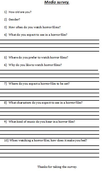
This is an image of our survey which as a group had over 15 people fill out.

As a group we got people to filled in over 15 of these surveys ranging in age, I believe this makes our research very reliable.

Analysis of question 1:
Through using this question we can then analyse further questions dependant upon the answer for this question.
Analysis of question 2:
Through using this question again we can evaluate the answers for further questions dependant upon the answer for this question.
Analysis of question 3:
Through using this question we then know how secure and reliable their answers are for further questions.
Analysis of question 4:
Through using this question we can then take ideas from the answers for this question and maybe incorporate them in our own horror opening sequence.
Analysis of question 5:
Through using this question we can then find out the majority of people who prefer to watch horror films at the cinema or at home then we know what should be shown for example if the majority said the cinema maybe you would put something to jump out on screen in.
Analysis of question 6:
Through using this question we know what people tend to enjoy or are attracted to in horror films which again we could incorporate into ours making it more successful.
Analysis of question 7:
Through using this question we can see if any answers have a pattern for example if a lot of people say the same thing and then we know for example not to include it because if we did ours wouldn't be unique or out of the ordinary.
Analysis of question 8:
Through using this question we can then know what is the norm and should we stick to it or not for example.
Analysis of question 9: 
Through using this question we then know what is and isn't unique because if everyone says the same thing we then know its successful and then we can do further research into that film where the sound came from and take elements from it for example.
Analysis of question 10:
Through using this question we know if the majority of the audience feel scared or not and then we can look at their other answers and incorporate some of the ideas from the conventions they talk about from some horror films for example.


Plot Synopsis:


Plot Synopsis:

Our draft version of our plot for the opening sequence is about a girl who is found dead in the woods by a couple. The girl is holding a crumpled up piece of paper which tells the audience the couple are next. The couple take no notice of the violent message as they think its a prank, still shocked by the dead body. One of the couple phones the police, however they lose connection and when they turn around one of the couple is gone. When the couple ring the police, the murderer should answer the phone as the police, so the audience know something the couple don't. Throughout the opening sequence they just see parts of the murderer but not his face.

This will leave the couple asking questions for example where did the member of the couple (preferably the man to challenge gender stereotypes) disappear to?

As a group we need a longer discussion on this for example we need to expand "on the crumpled piece of paper in the hand idea", because its not unique or out of the ordinary, there is no risk when using it.


Location Research:


Lancaster Gate Station:

This is an image of the inside of Lancaster gate station, it is very popular so it would be an ideal location for our group to film in because we would have many extras, and it would come across to the viewer as very realistic and not fake. This location would be effective to our genre because many horror films have central locations where people are in a rush, so they don't know if they are being watched or not and also a tube station when your on your own can sometimes be quite scary because you don't know who's around and its hard to know of you're being followed because there are so many carriages.

The woods of Nonsuch Park:

This is an image of the woods at Nonsuch Park which is very local. The woods here as you can see can be very deserted at some points of the day so if you were here alone you would feel very vulnerable.
The woods would be a great walk for a couple because they would be alone and they could have some time to talk to each other. However the woods are quite big so it would be easy to get lost and relating it back to our genre of horror, films of that genre sometimes use deserted locations which are big because the audience believe the characters are vulnerable and there's no-one around to help and its easy to get lost. 

Old children's home in Skyfall:

The old children's home used in James Bond Skyfall would be an ideal location for a horror film because it had many conventions of the horror genre for example it was old, remote and had history. What I mean by it had history is it had all the happy moments still in from the children who use to live their, there is usually a place like this in horror films where something is set for example an abandoned mansion which had a lot of history to it so it had a lot of memories which gets the audience thinking and feeling on edge.

Wednesday, 12 December 2012

Survey results

This is the analysis of  the answers from our groups questionnaire displayed through a Powerpoint:


Tuesday, 11 December 2012

Our Vox Pops for our genre; horror:


These are our groups vox pops edited, we asked three questions to our interviewees, but in the video we've edited it so a question is asked and then we have the answer for that question from the interviewees one after another this happens three times as there are three questions, and at the end we have a behind the scenes extended interview on the genre of horror with Jacob. The interviewers were me (George Dennehy) and Lindsay Brophy, the interviewees ranged mostly between 16 and 17 year olds and one adult. The questions asked were:

  1. Do you like horror?
  2. What do/don't you like about horror?
  3. What do you expect to see in horror films?
To conclude the vox pops we filmed, I have come to an answer for these questions dependant upon the answers from the interviewees. Overall the majority of the interviewees like horror films. Overall the audience like horror films because of the suspense followed by the killing scenes. Overall the audience expect to see old objects, murder weapons and vulnerable or not in the right state of mind people. I came to this conclusion by analysing each individual vox pop.

Friday, 7 December 2012

Thursday, 6 December 2012

Analysis of the exorcism of Emily Rose opening title sequence:


Analysis of Resident Evil Afterlife:


Monday, 3 December 2012

Analysis of Title Sequences:


Coraline -  title sequence:

The first title in this sequence is the title of the film this tells the audience straight away a bit about the film because the button used to replace the "O" in Coraline symbolises the character Coraline has buttoned eyes. Then after this is the name of some of the main characters in the film and finally credits of the film makers for example special effects and music producers, who did not have the same level of importance in the sequence because children wouldn't really take notice to them.


Archer - title sequence:

The titles throughout this sequence are in a "child like" font for example the use of capital letters aren't used correctly which reflects a child stereotypically this foreshadows that this film is going to be for a child. This sequence doesn't have any credits it just has the names of the actors this suggests that the titles in this sequence aren't suppose to be the main audiences attention and that the target audience is suppose to be for children because there is no technicality involved.


Anatomy of a murder -  title sequence:

This title sequence has body parts related to the title "anatomy" in most shots, this suggests to the audience that this film is going to be about Anatomy. One of the titles I especially noticed was "starring" this suggests it wants the audience to be aware that a special actor or actress is in the film. Also I noticed one of the shots just had a list of part of the cast this shows they are not equal to the main character because it said starring for him and he had his own shot to himself. Also the production designers and others, towards the end of the sequence were in a smaller font this suggests they weren't as important to the film as some of the characters.


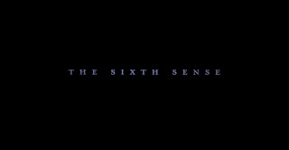
The sixth sense  - title sequence:


The title sequence for the Sixth Sense doesn't consist of any moving images in the background, it only consists of a black background. The colour black symbolises death, and also the fear of the unknown you don't know what is going to happen, all you know from analysing the background colour which is black is that something bad is going to happen. The titles fade in and out slowly, this maybe to foreshadow someone entering in and out of someone's life also this is used to build tension and suspense. The titles are in a serif font which symbolises that this film is serious and is not a laughing matter which against builds suspense and tension. Finally the titles appear in this light ice cold blue font this maybe to foreshadow death, because when a body dies and loses temperature the lips go blue, also this colour of blue maybe to show a pulse has gone which again suggests death.


Thursday, 29 November 2012


Spiderwick Chronicles Analysis:


Tuesday, 20 November 2012

Donny Darko practical task with annotations:


Sunday, 18 November 2012

Analysis of Bridget Jones; Romantic Comedy:


Sound:

Many different sound effects are used to show the audience that this opening sequence is a romantic comedy. For example dietetic sound is used when the phones answering machine says; "no new messages" this is used in conjunction with camera-work to tell or suggest to the the audience that she does that every five minutes, this suggests its very light hearted. The song Bridget sings at the end, the lyrics were "all by myself" this has several meanings one meaning could be that she's laughing at herself, again this makes this film a category of comedy. The music was slow, sad and sorrowful, however there was a big drum sequence, and this when Bridget turns into the song and changes her mind and she's presenting her self to the audience that she had enough she doesn't want to be by herself any more.


Cinematography:

Many different camera work techniques are used throughout the opening sequence to suggest to the audience what genre this film fits. For example one technique I picked up on was the use of the same camera position for a variety of  shots and the shots faded in and out with each other which suggests time went on and the only thing which changed in the shots were Bridget's positions, also the rule of thirds were used as well she was always in the third column which suggests she was on her own which reflected her relationship status, this was used to show the audience Bridget's feelings and emotions.

Editing:

Throughout this sequence there wasn't many noticeable editing techniques as there would be if the film was under the genre of thriller. One editing technique which I have mentioned already was the use of transitions especially fading in and out, however these haven't been discussed thoroughly. The fading in transition was used to show something in the shot has changed whether it was the objects in the shot have moved or the key of lighting has changed for example the later into the sequence the darker some of Bridget's room got. The fading out technique was used to show a period of time is over and that the shot in particular was ended or could've gone on  for a long time. These two techniques were used in conjunction with each over to show a period of time were Bridget has done nothing except lounge about. This left the audience reacting to Bridget's feelings and emotions, possibly even feeling sorry for her.

Mise en scene:

Different techniques of mise en scene were used to show Bridget's feelings. For example at the beginning the man and Bridget both had festive jumpers on this made the audience aware of the time of year it was. When Bridget is in her bedroom she is wearing a red Christmas shirt with snowmen or reindeer's on again this reminds the audience of what time of year it was and normally at Christmas time everyone is together however Bridget was on her own which again left the audience asking questions and feeling sorry for her.


Wallander Analysis:


Sound:

Many different sound effects were used to add and create suspense along side the shots. A sting was used because there was a sharp noise which increased in volume quickly which added emphasis to the important moment of when the girl closest to the screen dropped the knife, this was used not to only tell the story but show the audience and make them think which is the significance of the knife what does it symbolise? This leads the audience feeling puzzled and trying to piece together what's happened. Another sound effect used was hyperbolic sound an example of this is when the girls are walking away from the car you can hear there shoes on the gravel but the noise made is a lot louder than it would be if you were there, this is used to attract the audiences attention to the floor which then lets the audience relate to the surroundings of where they are and notify the audience that they are in the middle of nowhere.


Cinematography: 

Many different camera shots and camera movements are used to help the audience aware of what's happening with each scene. One particular camera movement which I noticed was when the camera tracked into the shot of the minicab from the sea, i believe this was used so the audience were aware of the surrounding of the minicab leading them to think many questions for example what was the minicab doing this far out there's nothing there? Another use of cinematography which was noticeable was the over the shoulder shot used I believe this was used so it could suggest to the audience to the tension between the two girls and show hat they weren't talking and who was the more domineering character because the one closer to the camera was further ahead so it looked like the other girl was just trailing a long and she didn't have an opinion or brain of her own, again this left the audience asking many questions.


Editing:

One editing technique which was very noticeable and was very clever because its effect on the audience was successful. The editing technique was called cross cutting it was used throughout the trailer apart from the titles and the very beginning shot, it was when the shots kept on going back and forth from the lifeless minicab driver and the tense young girls. This editing technique was and used and was so successful because it created a relationship between the girls and the minicab driver there was something the had in common and due to the rural surroundings it meant the audience could workout the state of the minicab driver was because of the young girls or they knew something about what happened or they were involved in some way or another.


Mise en scene:

From the way the girls are dressed it shows the audience that they weren't meant to end up were they are now we can tell this because if they planned to end up here they would of been in suitable clothing which there not in now. The girls dress sense reflects on stereotypes of being a punk/rebel trying push and break the boundaries, trying to be different and get way from the norm. The audience know this because she is wearing a leather jacket, has pink/red streaks in her hair and that she has a razor blade around her neck. The most noticeable use of mise en scene the produces used is that she is carrying a dagger in her hand which has blood on and again we the audience can relate her back to the surroundings and that the minicab driver is bleeding and there is no one else around except the other girl. This again leaves the audience making accusations and questions to ask for example did she stab him and how did the situation escalate to that level if she did? 


Thursday, 15 November 2012

Analysis of The Brick:


Screenshot of the Bricks Opening Sequence:


This is a screenshot of  Bricks opening sequence, as you can see this shot is a close up, and the characters position is a squatting position this shows they are anxious and they are not at ease this suggests they are thinking about something and they are under a lot of pressure to resolve a problem. Also the character is on a wall and is not very balanced this shows they are on edge which again symbolises there thoughts for example they may have to make a difficult decision.


Analysis of The Sixth Sense:


Monday, 5 November 2012


Momento: Analysis:


Mise en scene:

The mise en scene used in the short clip of Momento which was most noticeable was the costumes used because the killer was equipped with a gun, camera and glasses and he was in a suit but he was a bit scruffy so the impression he gave on the audience was he had been in the desert searching for days and that he hadn't washed this was not only shown through what he was wearing but also his unshaven stubble and out of control hair. The audience are then left with questions to ask for example what was he doing in the middle of nowhere and tired? However through the costume he was wearing the audience can relate him to stereotypes and he fitted the stereotype of a busy man, who had a lot of power and authority for example he could be in the world of espionage.

Editing:

Editing has a massive effect in films and in this short clip of Momento it had a huge impact because the editors used an editing technique which meant the audience watched the film from back to front which meant instead of him shooting him at the end he shot him at the beginning, this was very effective which left the audience wondering about a lot of questions. One editing technique which I found very impressive was the photo from the polaroid camera and the photo slowly disappeared. Another editing technique which showed the audience, the victim of the characters shooting which was an eye line match which was when the man in the suit looked at the gun and then looked at him and then looked back at him when he was dead where he had shot him, this was unnoticeable at first this is why it was so effective.

Sound:

Sound is used throughout the clip of Momento it is used to add tension and to set the mood of the scene. For example the soundtrack is very slow and hyperbolic and through the use of violins the audience could relate it to death which set the mood of the scene and let the audience foreshadow what was going to happen
.Hyperbolic sound is used when the man in the suit flaps the polaroid photograph and the noise of him flapping it is very loud this is used so the audience focus on the polaroid photograph because what was happening was important and significant to the story. Through using hyperbolic sounds it makes the audience have an easier understanding of what happening in the scene.

Titles:

Titles were used throughout the scene and the way the titles were formatted, helped set the mood of the scene for the audience. The titles were a cold blue, centred, slow, faded in and out, in capitals and they were in time with the music which made them very effective. Through using all these effects they made the clip feel very exaggerated and they reflected the content and mood of the scene.

Wednesday, 24 October 2012

What is a Trailer?

Trailers consist of a series selected shots from the film being advertised. Since the purpose of the trailer is to attract an audience to the film, these excerpts are usually drawn from the most exciting, funny, or otherwise noteworthy parts of the film but in abbreviated form and usually without producing spoilers. For this purpose the scenes are not necessarily in the order in which they appear in the film. A trailer has to achieve that in less than 2 minutes and 30 seconds, the maximum length allowed by the MPAA. Each studio or distributor is allowed to exceed this time limit once a year, if they feel it is necessary for a particular film.


What is a title sequence?


A title sequence is the opening sequence of a film with continuity editing done to change the order of which the clips are shown within the film.  Opening sequences have titles during the sequence, showing the names of the actors, film director and maybe others such as story boarders and producers. They use Continuity editing so that the audience understands what the plot of the opening sequence is about and gives a taste of what the overall film is about.

What are the differences?

The difference between the two are: that opening sequence is continuity editing where as the trailer is a montage of clips. A Trailer would usually last a maximum of two minutes, where as an opening sequence could last approximately between 2-10 minuets. The purpose of a trailer is to get the audience to watch the film, where as the main purpose of an opening sequence is to give the audience an idea of what the film is about and to try and encourage the audience to watch the film.

An Example of a Trailer could be the new "Taken 2":


An Example of an Opening sequence could be for "Batman":


Tuesday, 9 October 2012


EBI: The performance wasn't improvised and if the actors had lines of dialogue already rehearsed and learnt off by heart. We used a long shot and if  we used a match on action.

WWW: I believe we used all the factors of continuity editing in class today and applied them to our video.