Analysis
of Title Sequences:
Coraline
- title sequence:
The
first title in this sequence is the title of the film this tells the
audience straight away a bit about the film because the button used
to replace the "O" in Coraline symbolises the character
Coraline has buttoned eyes. Then after this
is the name of some of the main characters in the film and finally
credits of the film makers for example special effects
and music producers, who did not have the same level of
importance in the sequence because children wouldn't really take
notice to them.
Archer
- title sequence:
The
titles throughout this sequence are in a "child like"
font for example the use of capital letters aren't used
correctly which reflects a child stereotypically this foreshadows
that this film is going to be for a child. This sequence doesn't have
any credits it just has the names of the actors this suggests that
the titles in this sequence aren't suppose to be
the main audiences attention and that the target audience is suppose
to be for children because there is no technicality involved.
Anatomy
of a murder - title sequence:
This
title sequence has body parts related to the title "anatomy"
in most shots, this suggests to the audience that this film is going
to be about Anatomy. One of the titles I especially noticed
was "starring" this suggests it wants the audience to
be aware that a special actor or actress is in the film.
Also I noticed one of the shots just had a list of part of
the cast this shows they are not equal to the main character because
it said starring for him and he had his own shot to himself. Also the
production designers and others, towards the end of the
sequence were in a smaller font this suggests they weren't as
important to the film as some of the characters.
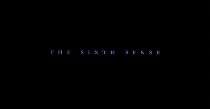
The
sixth sense - title sequence:
The title sequence for the Sixth Sense doesn't consist of any moving images in the background, it only consists of a black background. The colour black symbolises death, and also the fear of the unknown you don't know what is going to happen, all you know from analysing the background colour which is black is that something bad is going to happen. The titles fade in and out slowly, this maybe to foreshadow someone entering in and out of someone's life also this is used to build tension and suspense. The titles are in a serif font which symbolises that this film is serious and is not a laughing matter which against builds suspense and tension. Finally the titles appear in this light ice cold blue font this maybe to foreshadow death, because when a body dies and loses temperature the lips go blue, also this colour of blue maybe to show a pulse has gone which again suggests death.

No comments:
Post a Comment